User Guide
A powerful customizable dashboard tool for Unity that helps you organize and manage your ScriptableObjects with style.
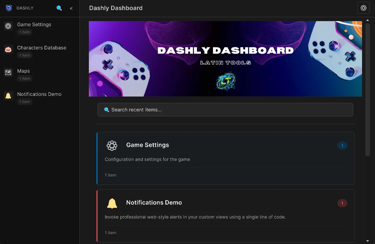
🚀 Open the Dashboard
Section titled “🚀 Open the Dashboard”You have multiple ways to access Dashly depending on your needs:
From the Unity Menu
Section titled “From the Unity Menu”Open Dashly from the main menu or with the keyboard shortcut:
Tools > Latin Tools > ☰ Dashly Dashboard💡 Quick shortcut: Press Ctrl/Cmd + M (default) to open the Dashboard.
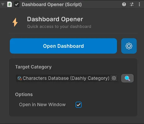
Dashboard Opener Component
Section titled “Dashboard Opener Component”You can open categories directly from a scene in the Inspector:
-
Add the
Dashboard Openercomponent to any GameObject. -
Drag a
DashlyCategoryinto the field or search it directly. -
Click Open Dashboard to instantly open the selected category (you can force it to open in a new window).
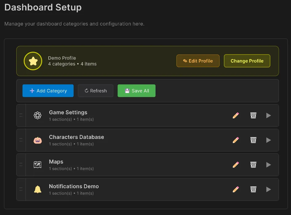
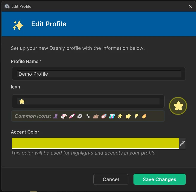
👤 Profile System
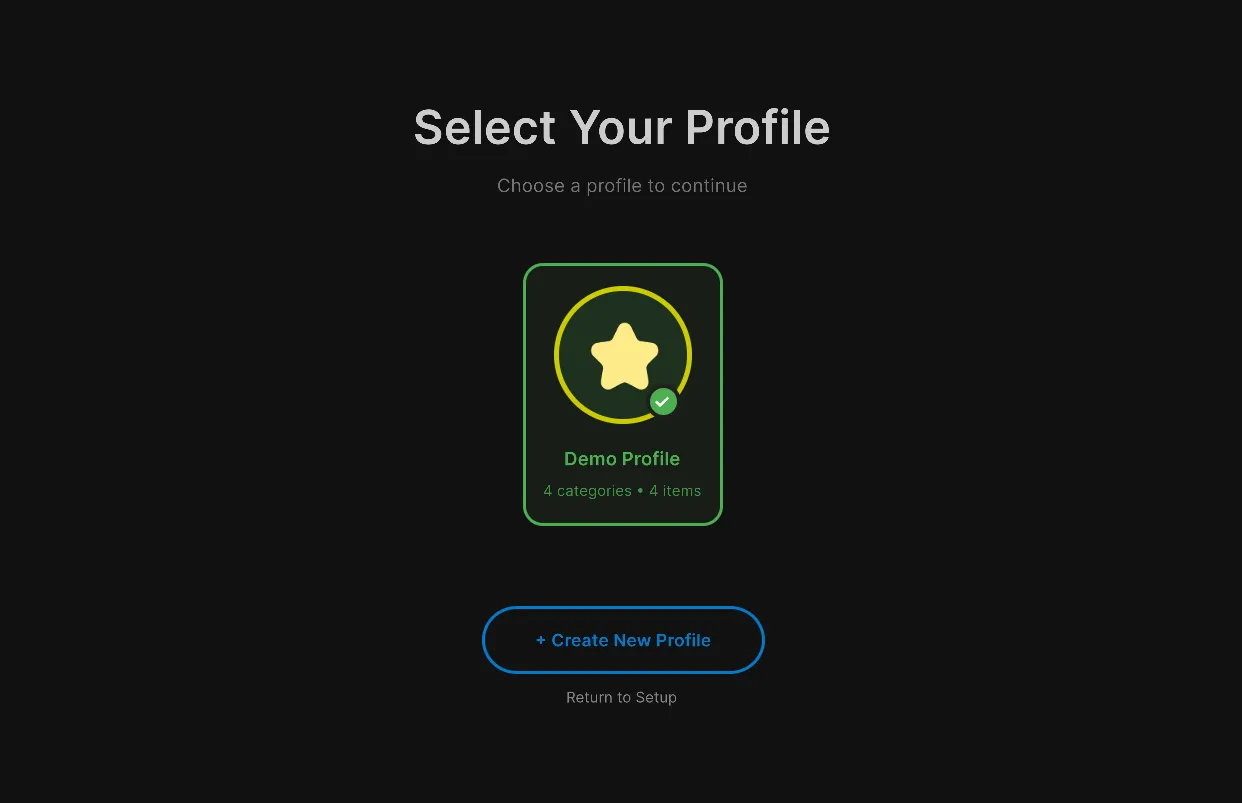
Section titled “👤 Profile System”Dashly supports multiple Profiles, helping you split game data by department (for example, Design, Art, Audio) or other contexts.
-
When Dashly opens, access the Profile Selector by pressing the profile/settings button (⚙️) and the Change Profile option.
-
Click Create New Profile or edit an existing one.
-
You can assign a Name, Emoji Icon, Primary Color, and its related categories.
-
Switch quickly between profiles in the main dashboard.
📁 Create categories
Section titled “📁 Create categories”-
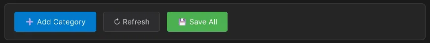
Click the Settings (⚙️) icon in the header.
-
Click ➕ Add Category.
-
The category is automatically added to your configuration.
-
In Project:
Right-click > Create > Latin Tools > Dashly > Category. -
Open the DashlyConfiguration asset.
-
Add your category to the Categories list.
-
Save the configuration.
Configure categories
Section titled “Configure categories”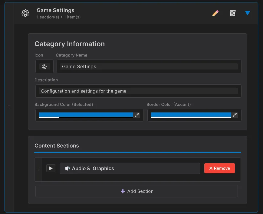
Each category supports:
| Property | Description |
|---|---|
| Name | Name displayed in the sidebar |
| Icon | Emoji for visual identification (📦, ⚙️, 👥, 🎮, etc.) |
| Description | Optional extra context |
| Sections | Content structure inside the category |
Suggested emojis
Section titled “Suggested emojis”- 📦 Inventory/Items
- ⚙️ Settings/Configuration
- 👥 Characters/NPCs
- 🎮 Game mechanics
- 🎨 Art/Visual
- 🔊 Audio/Sound
- 🗺️ Levels/Maps
- 📊 Analytics/Data
🗂️ Manage sections
Section titled “🗂️ Manage sections”Sections help you organize ScriptableObjects inside each category.
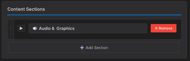
Add a section
Section titled “Add a section”- Select a category in the Inspector.
- Go to the Content Sections block.
- Click ➕ Add Section.
- Enter a section name.
- The new section appears collapsed by default.
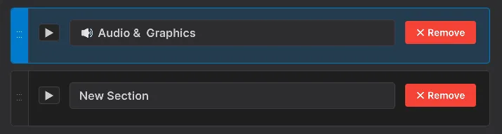
Edit a section
Section titled “Edit a section”Click the ▶ arrow to expand and:
- Rename the section.
- Add or remove ScriptableObjects.
- Reorder elements.
Reorder sections
Section titled “Reorder sections”Use the ⋮⋮ handle on the left side to reorder with drag and drop.
Remove sections
Section titled “Remove sections”Press ✕ Remove in the section header and confirm deletion.
➕ Add Content
Section titled “➕ Add Content”Dashly lets you add two major content types into your sections: ScriptableObjects and Custom Content (code-driven content).
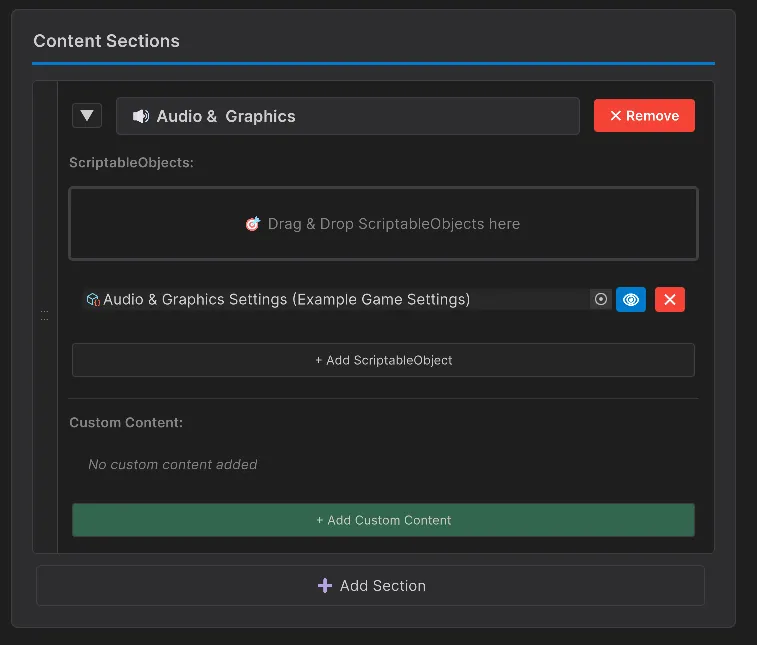
Add ScriptableObjects
Section titled “Add ScriptableObjects”You have three ways to add your ScriptableObject data:
1) Drag and Drop (recommended)
Section titled “1) Drag and Drop (recommended)”-
Expand a section in the category editor.
-
Drag ScriptableObject(s) from the Project window.
-
Drop them into the Drop Area.
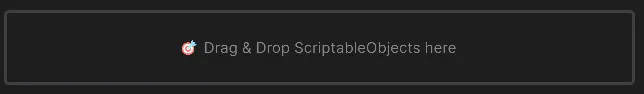
-
You can add multiple objects in one action.
2) Manual selection
Section titled “2) Manual selection”-
Expand a section.
-
Click + Add ScriptableObject.
-
Use the object picker to select the asset.
-
Repeat to add more objects.
Per-object management
Section titled “Per-object management”For each added ScriptableObject, you can:
-
📍 Focus: highlight the asset in the Project window.
-
🗑️ Remove: remove it from the section (without deleting the asset).
-
View Details: inspect properties inline.
Add Custom Content (Advanced)
Section titled “Add Custom Content (Advanced)”You can integrate code-generated interfaces directly into Dashly sections (useful for custom tools).
-
Create a C# class that inherits from
DashlyContentData. -
Add the
[DashlyContent("Name", "Icon")]attribute above the class. -
Define the base methods, returning the
MethodInfothat renders content. -
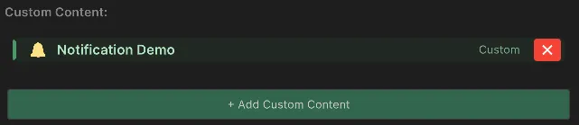
Go to the Category Inspector and, in your Dashly section, press + Add Custom Content.
-
Any class tagged this way will be detected automatically.
Custom Content example
Section titled “Custom Content example”Below is a complete code block you can use as a base to create a custom view:
using UnityEngine;using UnityEngine.UIElements;using LatinTools.Dashly;using System.Reflection;
// 1. Add the attribute so Dashly can detect it[DashlyContent("Test Tool", "🔧", Description = "My custom panel.")]public class MyTestCustomContent : DashlyContentData{    // 2. Override metadata for how the component appears in its header    public override Data GetData()    {        return new Data        {            Title = "Test Tool",            Icon = "🔧",            Description = "Adjust the master variables in this section.",            // IMPORTANT: Send the reference to the method that will draw the UI            DrawContentFunc = GetMethodInfoOf(nameof(DrawContent)),            AccentColor = new Color(0.15f, 0.65f, 0.9f)        };    }
    // 3. Define visual content using UI Toolkit    public static void DrawContent(DashlyContentContext context)    {        var label = new Label("Hello world from code!");        label.style.fontSize = 16;        label.style.color = new StyleColor(Color.white);        label.style.marginBottom = 10;
        var notifyButton = new Button(() =>        {            Debug.Log("Running action from tool!");        })        { text = "Press Button" };
        // Add everything to the root assigned to your section        context.RootElement.Add(label);        context.RootElement.Add(notifyButton);    }}
🎨 Customize appearance
Section titled “🎨 Customize appearance”Dashly allows full customization through its preferences system.
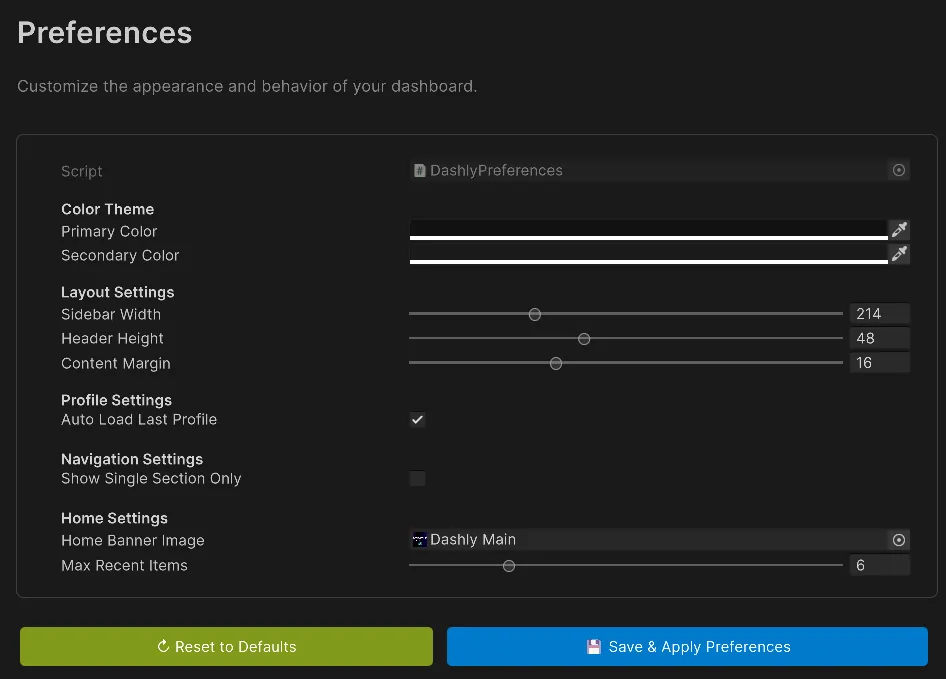
Theme and layout settings
Section titled “Theme and layout settings”| Group | Options |
|---|---|
| Color Theme | Primary Color, Secondary Color |
| Layout Settings | Sidebar Width (180-300px), Header Height (40-60px), Content Margin (8-32px) |
| System Settings | Max recent items configuration and Auto-load Profile. |
| Home Banner | Choose or change the logo shown on the welcome screen. |
⚡ Advanced features
Section titled “⚡ Advanced features”Home Screen and Recents
Section titled “Home Screen and Recents”At startup, or with no tabs open, you get a quick screen:
- Provides quick access to Documentation and Support.
- Recent Categories (session-scoped) let you return to work instantly.
- You can change the maximum number of shown entities in Preferences.
- It is accessible by clicking the DASHLY title in the sidebar (even when minimized).
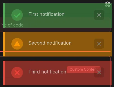
Notification System
Section titled “Notification System”Any save action, successful section load, error, or other interaction triggers a temporary, self-explanatory visual notification (green, amber, red) on the top side.
Use notifications in Custom Content
Section titled “Use notifications in Custom Content”As part of your custom logic (using the DashlyContentContext parameter in methods), you have full access to the Editor notification system. Here is how to integrate status reporting with context.ShowNotification:
public static void DrawContent(DashlyContentContext context) { var saveButton = new Button(() => { // Run logic... bool operationSuccess = true;
if (operationSuccess) { // Success notification (Message, Type, Duration ms) context.ShowNotification("Data saved successfully!", NotificationType.Success, 3000f); } else { // Error notification context.ShowNotification("Error while processing data.", NotificationType.Error, 3000f); } }) { text = "Save and Notify" };
var warnButton = new Button(() => { // Warning notification context.ShowNotification("Do not forget to restart the scene.", NotificationType.Warning, 4500f); }) { text = "Warning" };
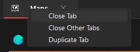
context.RootElement.Add(saveButton); context.RootElement.Add(warnButton); }Multi-tab support
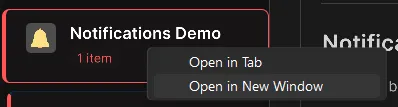
Section titled “Multi-tab support”
Work with multiple categories in parallel:
- Open in New Tab: right-click on a category.
- Switch Tabs: click tab headers or use
Ctrl/Cmd + TabandCtrl/Cmd + Shift + Tab. - Close Tab: ✕ button or
Ctrl/Cmd + W. - Duplicate and more: use the top context menu on your tab to duplicate windows and close all others at once.
Search functionality
Section titled “Search functionality”
-
Press 🔍 Search in the sidebar header.
-
Type your term.
-
Matches in categories/sections are highlighted.
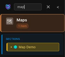
-
Non-matching elements are hidden.
-
Press 🔍 again or clear the field to restore the view.
Search highlights:
- Yellow background indicates matches.
- Section navigators auto-expand when there is a match.
Section Navigator
Section titled “Section Navigator”When a category has multiple sections:
-
The Section Navigator appears below the active category.
-
Click a section name to jump directly.
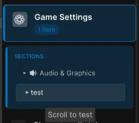
-
Content scrolls smoothly.
⌨️ Keyboard shortcuts
Section titled “⌨️ Keyboard shortcuts”| Shortcut | Action |
|---|---|
Ctrl/Cmd + M | Open Dashly Dashboard window |
Ctrl/Cmd + Tab | Switch to next open tab |
Ctrl/Cmd + Shift + Tab | Switch to previous tab |
Tab | Hide/Show (toggle) sidebar state |
Middle Click / Ctrl + Click | (On category) Open category in a new tab |